The appeal of sheer simplicity in interior design and tiling schemes
We are pleased to introduce American interior designer, Kate Roos, who has kindly agreed to share her thoughts on current design trends and to talk us through her thought process when it comes to choosing tiles for her clients’ homes.
Kate Roos is a Minneapolis - based kitchen and bath designer focused specifically on cabinetry design for the whole house, space planning and material and product selection. She has used Winchester tiles in one of her recent stunning projects and we used the opportunity to speak to her about aesthetics, practicality and achieving balance between the two. The beautiful photos illustrating Kate’s work were taken by talented commercial & residential photographer, Andrea Rugg. Kate sourced her clients’ tiles at Rubble Tile.
All images belong to Andrea Rugg and are only authorized for use on this blog.
Q. What kind of customers do you usually get and what kind of services are they primarily looking for? A.The majority of my clients are looking to completely re-imagine their kitchens or bathrooms and I help guide them through the process. I need to understand what the client hopes to achieve with the remodel. How do they want the room to feel: warm and inviting, modern or traditional? How they would like the space to function: who does the cooking, cleanup, how many family members are in the space at any given time? Space planning and cabinetry design define the layout, look and function of the space. Backsplash tile, countertop, lighting and hardware selections bring character to the room. I also love staying involved during construction to manage design details and witness the new space come to life!
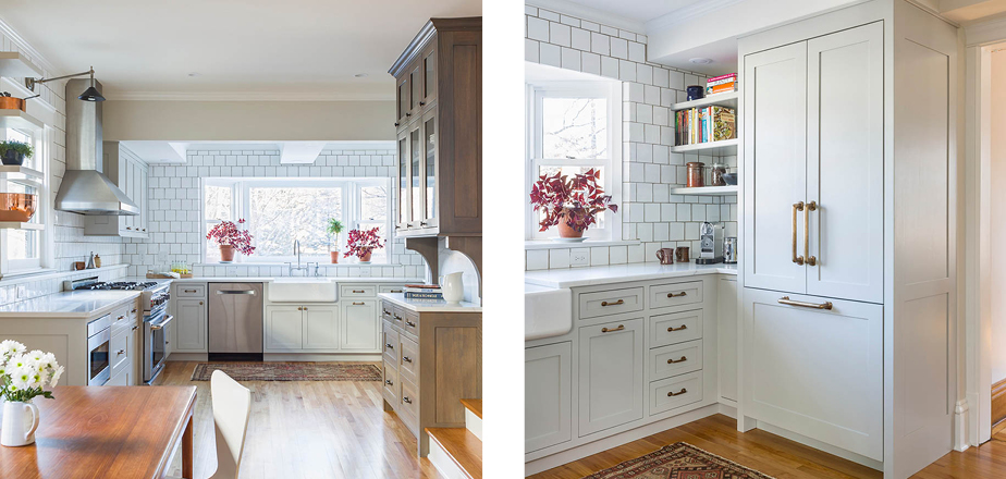
Q. What is your biggest challenge when it comes to home décor? A. Challenges arise regularly when designing kitchens and bathrooms. Often the space is limited due to poorly placed ductwork or lack of expansion opportunities. Creative solutions are paramount to attaining the kind of function my clients want. Planning the space is exciting - I explore the limitations and opportunities and I push myself to find the best outcome.
The client's budget also drives my creativity. Kitchen remodels can add up quickly, so I am cautious about making dramatic choices like moving plumbing, taking out walls, or moving windows and doors. Understanding where clients should splurge and where they should be prudent is a large part of the design process.
Q. How important are kitchens and bathrooms when it comes to decorating a house? A. Without a doubt kitchens and bathrooms are the most costly remodels and the most rewarding. People spend a lot of time in these spaces and it’s very important not to rush through the design process. The finishes in these spaces are fixed, meaning they are locked into the space making them difficult and costly to replace. How you feel and interact in the space is a high priority. Bathrooms should be both relaxing and functional with good lighting and easy-to-clean surfaces. Kitchens should allow for effortless cooking and entertaining with high quality finishes and proper storage. Taking time to work through the details before the remodel ensures that the kitchen or bath will work for you and exceed your expectations.
Q. Would you say that American customers place special value in products that are designed and made in England? A. Products that are made in England add a special quality to any American design, providing a sense of history and tradition. Often these products are made using centuries old techniques, fine craftsmanship, and offer an understated elegance. Products like lighting, tile, and hardware can be that special element that pulls the room together.
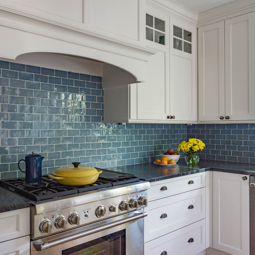
Q. When choosing tiles for your customers, what exactly are you looking for? A. Tile can be an overwhelming item to choose. I usually start with the countertop, because there are fewer options than there are with tile. Once the counter is selected we begin thinking about tile; the color, shape, material. Tiles should enhance the space and add some contrast to other elements in the room, be it with texture or hue. Tile is an opportunity to have fun and take some risks if you are so inclined. If the counter is polished, a matte or rustic finish of the tile can temper the luster; if the countertop is honed, shiny tile can be a lovely way to bounce light through the space. For traditional designs a subway tile is perfect. I love unexpected sizes like 2”x8”, 3”x12” or 5”x5” installed in a ½” or 1/3” offset brick pattern. Selecting a handmade tile with variation in shape and glaze can add interest and shimmer as well.
Q. What advice would you give to people looking to create fabulous tiled focal points in their homes? A. When it comes to a kitchen or bath focal point, take cues from other elements in the space. If the space already has several bold elements, I would create a framed tone-on-tone focal point over the range. Finding a tile line like Winchester Tile Company that offers various formats, beautiful glazing, decorative tiles and different finishes makes implementing tonal choices easy. Choose a color that you love, choose a field tile, a pencil or border tile to be used for the frame and have a play with tiling patterns for the interior. This approach adds visual interest and textural variation without adding a new color to the space. There are endless ways to add an interesting focal point with tile, so experiment and see what you like!
Q. Has there been a shift in tile format preferences in the American market? A. In Minnesota, where I live, the traditional subway tile is still quite desirable. New tile options with bold color and texture are abundant, but when it comes to final decisions, a simple subway tile format is tried and true and always timeless. You can't go wrong. I try to transition away from the classic running bond 3”x6” when possible with different sizes (2”x8”, 3”x12”, etc.) and different installation options like 1/3” offset or stacked: a mix between modern and classic!
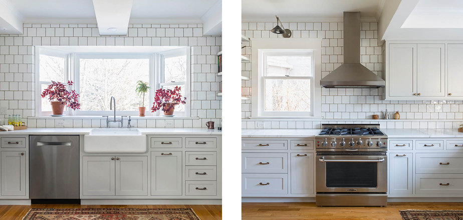
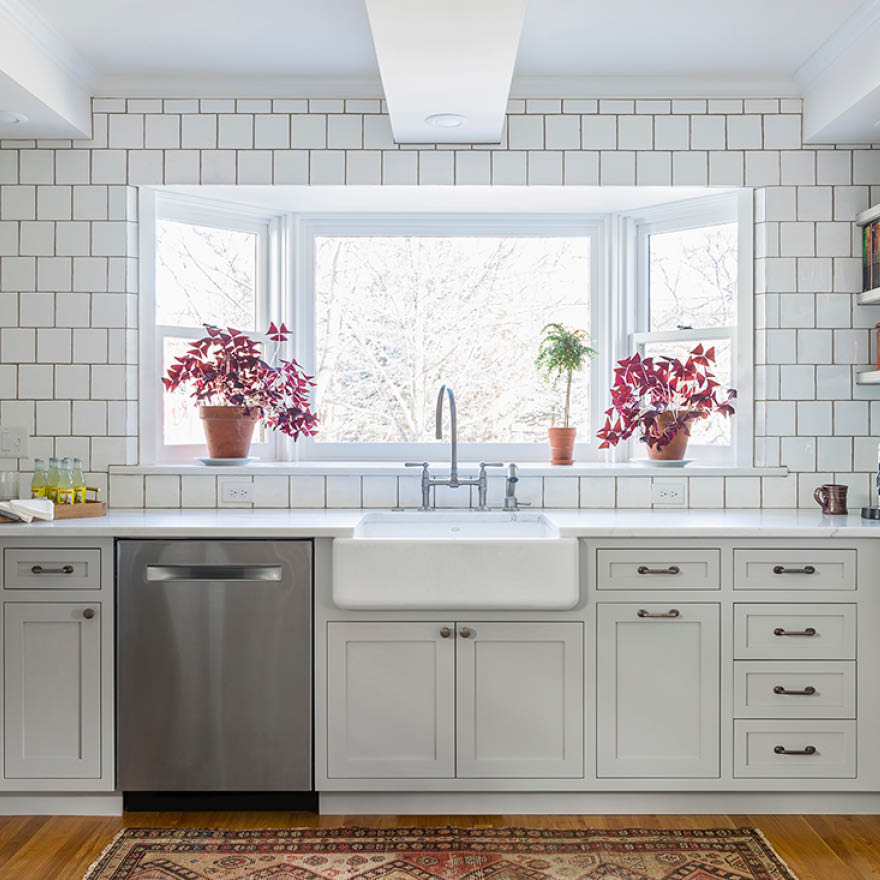
Q. Why did you choose tiles from The Winchester Tile Company? What was it about the product that you found appealing and where did you source the tiles from? A. I have always loved the tile offerings from Winchester Tile Company, and when you find something you love, you find ways to use it! The range of colors and glazes are endless, and the handmade look of the tile is exceptional. When we selected tile for the St. Anthony Falls Kitchen, my clients wanted something traditional yet unexpected and the offset 5”x5” tiles were perfect. The tiles sparkle when the sun streams through the windows making the space feel distinctive.
Q. How did you hear about The Winchester Tile Company? A. I discovered The Winchester Tile Company through my local supplier, Rubble Tile in Minnesota, and I have been finding ways to use it ever since. They are always knowledgeable and so helpful in steering me in the right direction. I was trying to find a white subway tile in just the right shade of off-white and The Winchester Tile Company had the perfect color. They are now one of my go-to tile manufactures. I can always find interesting color, sizes, textures and sheens.
Photo's by commercial & residential photographer, Andrea Rugg
