A makeover story with Jason from @number15_on_the_park featuring a beautiful kitchen, pantry and stunning porch

Real life home projects bring us so much joy, especially when they feature fabulous tiled, focal points - that’s why we were delighted to collaborate with Jason from @number15_on_the_park on some of his beautiful home renovations. Using tiles from our Winchester and Victorian Floor Tile collections, Jason has styled three gorgeous areas of his home, we caught up with him to find out more.
Jason: I started my home interiors Instagram account @number15_on_the_park on, 27 December 2020 just as we purchased the property. The house was a total renovation and remodel and I thought it would be a good medium to use to document the build process as we turned the property back into a beautiful family home. What I never realised until I started the account, was how vast and prolific the home interiors community is on Instagram. We have connected with so many wonderful people and accounts over that time, some of whom have become real life friends!
Our property was built in 1950 by a local builder on a large plot of land which was effectively countryside back in the day. Our property backs onto a local historic park and the old village cricket pitch (hence our Instagram name).
Original Style: What would you say is your interior style and what were the main objectives of your tiling projects?
Jason: My tastes have definitely changed from our former home which was a traditional Georgian design with high ceilings. However, I love those period features and knew we wanted to incorporate these into our new designs and vision for the space. Number 15 was very tired when we purchased it and stuck in the 1950’s with some 1970’s add on features which just had to go as they were neither in keeping or sympathetic to the style or design we had planned. So out came the large oppressive brick fireplaces and in their place went modern sleek fires with traditional limestone fireplaces.
Today I would describe my style as ‘classic modern rustic’ think farmhouse vibe – relaxed, but still with a sharp tailored and traditional look in places to balance it all out.
Original Style: Where did you find the inspiration for your kitchen and pantry?
Jason: I often draw inspiration from Instagram and interior magazines – but the look I had for the kitchen and pantry was always about a farmhouse feel; yet with a functional modern design but it had to look pretty too. Think interior swoon worthy images that wouldn’t look out of place in a magazine. That’s where the over the top pot filler tap comes in. It is both practical but it something beautiful to look at too that is almost a piece of art in itself.
Original Style: What made you choose Original Style’s Winchester tiles for your kitchen and pantry?
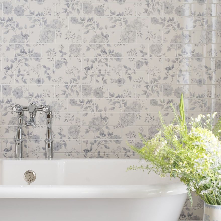
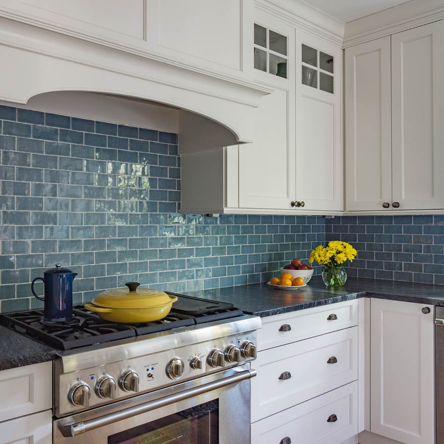
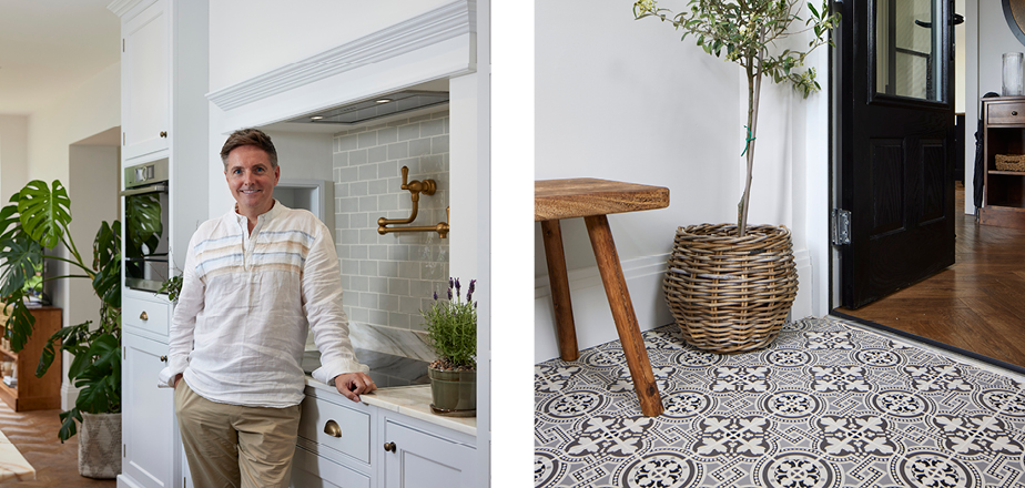
Jason: We had used a very striking Borghini Marble in the kitchen and pantry counter tops so we needed something to complement and not work against that. We had used Original Style Victorian tiles already in the porch and knew they were our go-to for a solution. I found the Winchester collection and felt this would be perfect for that rustic yet refined Farmhouse feel for the pantry. The Winchester Cosmopolitan range comes in a variety of muted pastel shades in a field tile, half tile, 200mm and 300mm brick size so the possibilities are endless. I ordered several samples and shades in different sizes in order to make a choice. Their signature undulating soft shimmery surfaces with the uneven edges was perfect for the chic yet artisanal look I was going for.
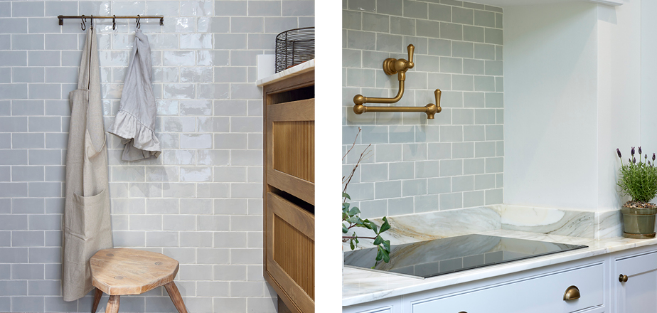
Jason: Although these are separate rooms in themselves, the kitchen and pantry occupy the same space within a space (albeit the pantry has its own door) so it needed something to hang it altogether and provide that cohesive designed feel to it.
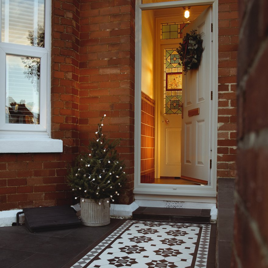
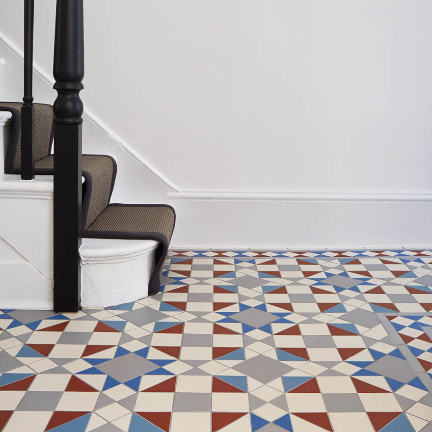
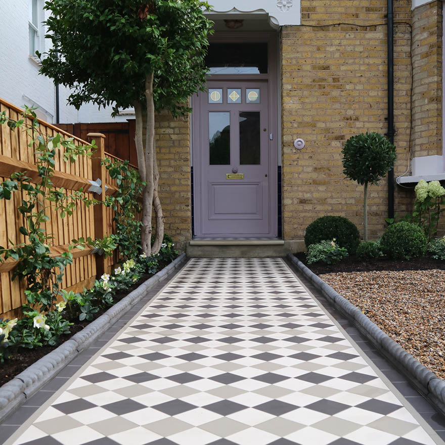
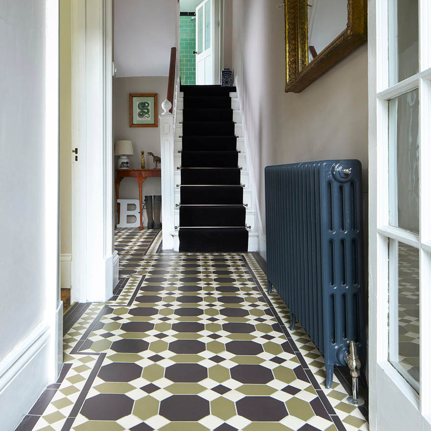
We had used the Victorian Salisbury floor tiles in the porch and the quality and look of the tile matches perfectly with timeless and traditional style but in keeping for a modern practical home. The Victorian tiles have that beautiful geometric design which is immediately recognisable as being Victorian but still works for a modern home interior. Our refurbishment and renovation has always been about using British quality materials and Original Style tiles meet that brief.
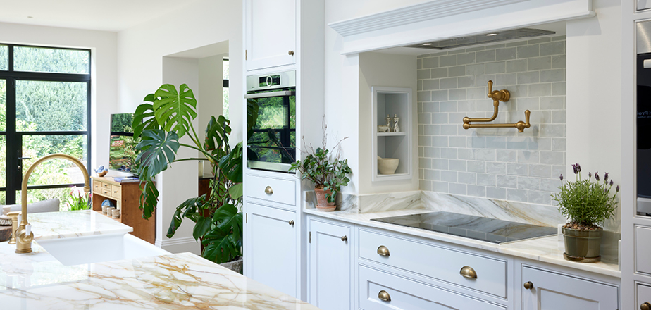
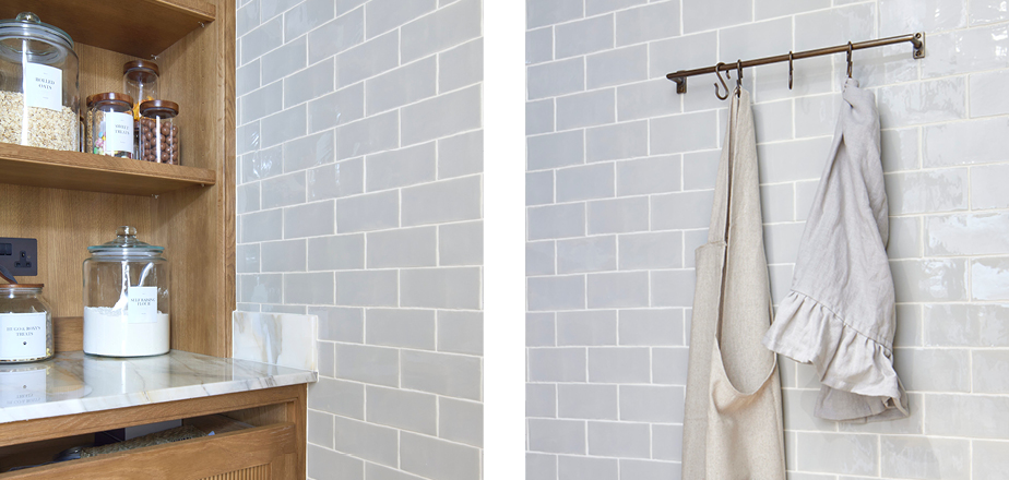
Jason: The kitchen and pantry tiles have that handmade feel to them with a softness that really comes to life when installed over a large area. You can definitely see that undulating pattern created by those natural rustic edges on the tile. The glaze and that undulation gives a sense of movement within the tiles and exudes that chic rustic charm - Perfect for our modern farmhouse interior inspired kitchen.
Original Style: What made you choose Original Style’s Victorian Floor tiles for your porch?
Jason: The porch was one area that I wanted to bring about some classic design features; but for these to look like they had always been part of the property. This area was less about putting in shiny new products and more about finding products and materials that looked like they were always part of the original house.
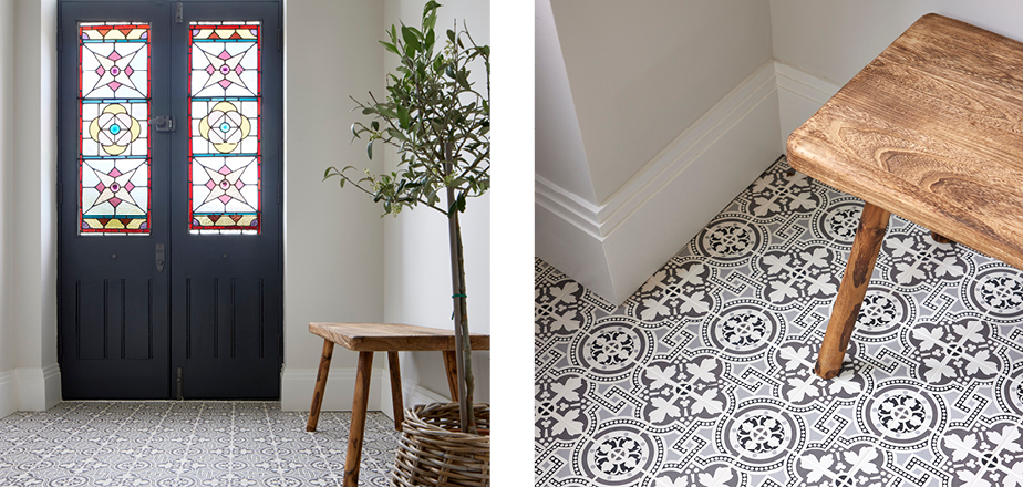
We ripped out a badly built 1970’s porch that leaked when it rained and added a much larger welcoming porch with a gable roof and vaulted ceiling to add some height and drama for a large chandelier. We found some old doors that were over 100 years old and some equally old stained glass that had seen better days at a local reclamation yard. Dave the owner, convinced me he could do something special with them and he didn’t disappoint! I just needed to find the perfect tile that would add the wow factor but also be practical to take the demands of a busy home with the daily traffic in and out the porch. The Salisbury tile in Black on Dover White was the perfect geometric pattern to complement the muted palettes for this room. It adds sufficient impact without dominating the space and I couldn’t be happier with the outcome. Even the postman loves the tiles and never fails to tell me every day he delivers the post. The tiles receive lots of compliments from visitors!
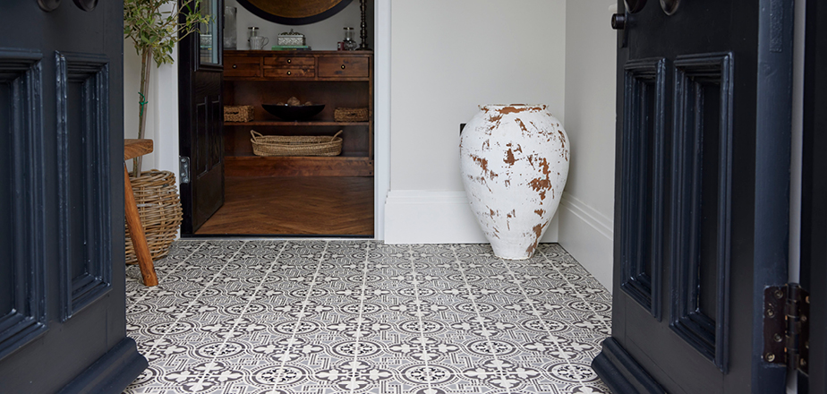
Jason: We’ve used a professional tiler for our all our projects. Whilst lots of people told me I could install the pantry and mantle tiles (as they would be simple with no pattern) I felt it important to leave this to the professionals. The porch took just a day to install and the pantry and hob took a couple of days with the grouting being completed once everything had set.
Every element of our designed spaces has been carefully thought through to ensure it met with the original brief and look we were going for. Every room needed to flow and work with all of the other spaces to provide that considered and effortless designed feel without being too contrived or stuffy. Whilst I love beautiful interiors; they need to work for how we live and use the space, especially with two dogs. All materials therefore need to not only look and feel beautiful but need to be practical and hardwearing. Original Style met all these requirements and they are a British brand too.
Original Style: What advice would you give to people looking to incorporate tiles within their interior?
Jason: There are so many tile choices on the market today to suit all budgets. My advice would be to think about what you need the tile for and where it is intended to be used and ensure you pick the right tile for the job. Play around with colour, texture and pattern – to create moods for the room you are designing. Tiles can be the perfect choice to create an accent feature or colour to a scheme. Pick a colour palette that you are happy with and stick to it! If you are working with a patterned tile that has multiple colours in it, then pick a base colour from the tile design and use a complimentary shade or contrasting colour for the other elements or materials. This will bring balance and cohesion to your design.
