2019 Interior Trends & Tiles with The Design Sheppard
We’ve had the greatest pleasure working with Stacey Sheppard, author of The Design Sheppard, in creating today’s blog post.
As a global tile company, we always make it a priority to ensure we’re on top of the latest interior design trends. Stacey’s wonderful blog has recently been crowned the ‘Top UK Blog for Interior Design Inspiration’ and so, collaborating with The Design Sheppard for our 2019 trends blog was a natural calling. We also approached our New Products & Design Manager, Jane Addis, for her expert opinion on what Original Style tiles will best complement each trend. The following post has been written by Stacey Sheppard herself. We hope you thoroughly enjoy the read (we did!) and are left feeling inspired and ready to take on 2019!
As the New Year approaches, I always get rather excited because a new year also means a whole host of new trends that will be making their way into our homes. This doesn’t mean that we all need to think about completely redecorating every room in our homes in order to keep up with the trend setters. That would be madness and who has the time or budget to completely redecorate every year anyway?
I personally love following the trends but this doesn’t mean that I adopt them all. Instead I take them all in so I know what colours, materials, textures, patterns, shapes, finishes and general product lines I can expect to see on the market. I then decide which of these I particularly like and can live with on a long term basis, and it is those elements that I may bring into my own home.
There are a number of interior trends that we will see coming through in 2019 that have got me rather excited and I’d like to share my top five with you today along with some stunning mood board imagery that shows you exactly how you can get this look in your own home.
Rough Luxe
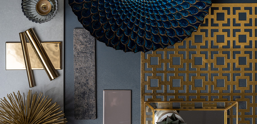
This is probably one of my favourite trends and one I’ll definitely be bringing into my own living room. Rough luxe sees rough, industrial finishes working alongside more refined and luxurious pieces. So we can expect to see lots of warm metallics like copper, brass and gold paired with exposed brick, concrete and rough timber finishes.
This trend elegantly combines two completely contrasting styles that work so well together.
To help you achieve this look, Jane Addis recommends: Pairing Midnight Blue, a stunning metal-effect tile with; Tileworks Antico Casale Fumo – an exposed brick-effect tile Artworks London Stone tiles, Artworks Gold tiles and mouldings
Natural Selection
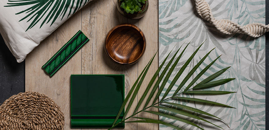
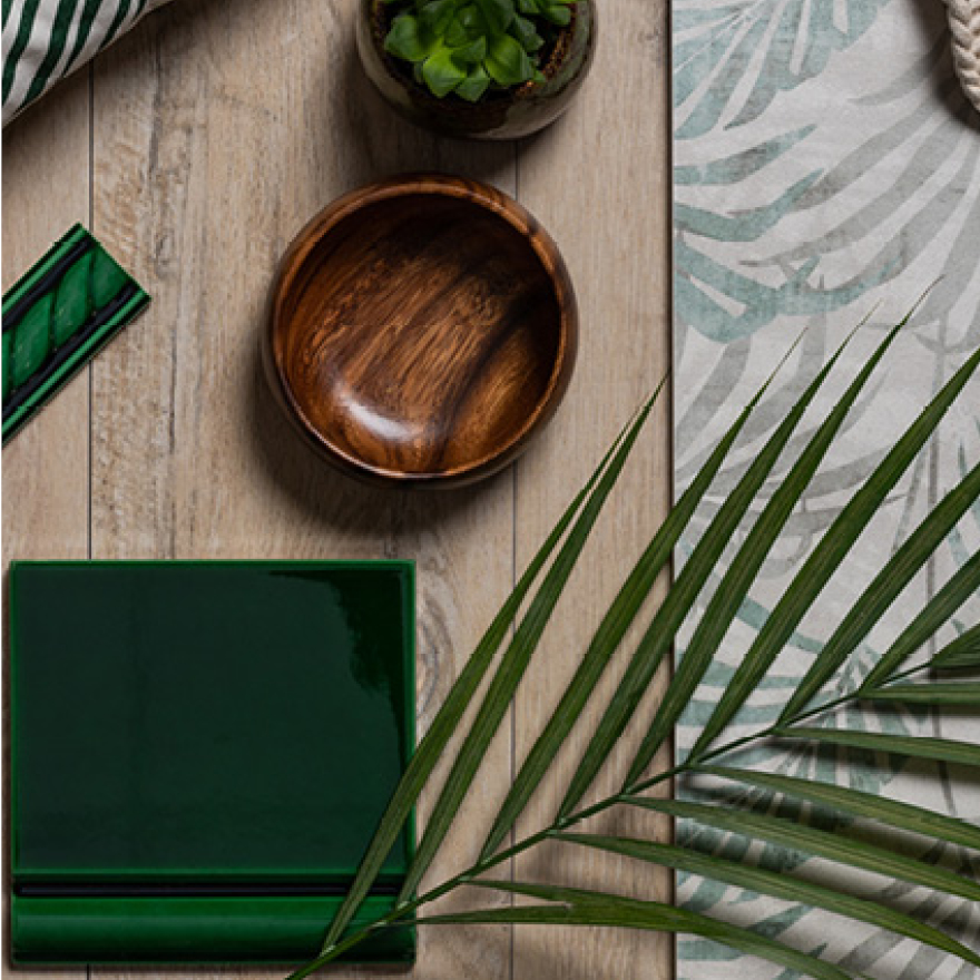
Natural Selection is a good description of what I’ve been aiming for in my living room for a few years now. This trend has a focus on careful craftsmanship and natural materials like wood, rattan, seagrass, wicker, cork, bamboo and terracotta.
It can be identified by the predominance of textural weaves used in accessories like lighting, chairs, room dividers, planters, and storage baskets. There is a strong leaning towards imperfect finishes, and artisan, tactile accessories.
The colours that feature in this trend are also very natural so lots of muted earthy tones and especially lots of dark green.
This trend also features lots of plants and foliage, preferably live ones, but for those who aren’t particularly green fingered then faux foliage is just as acceptable in achieving the look. Failing that, botanical prints on wallpaper, tiles and fabrics will do the job nicely.
To embrace Natural Selection in your home, Jane recommends: Hothouse; a palm print tile from the new Original Style Living range, Artworks Victorian Green tiles and mouldings and Tileworks Lignum Cream Natural wood-effect tiles
70s Revival
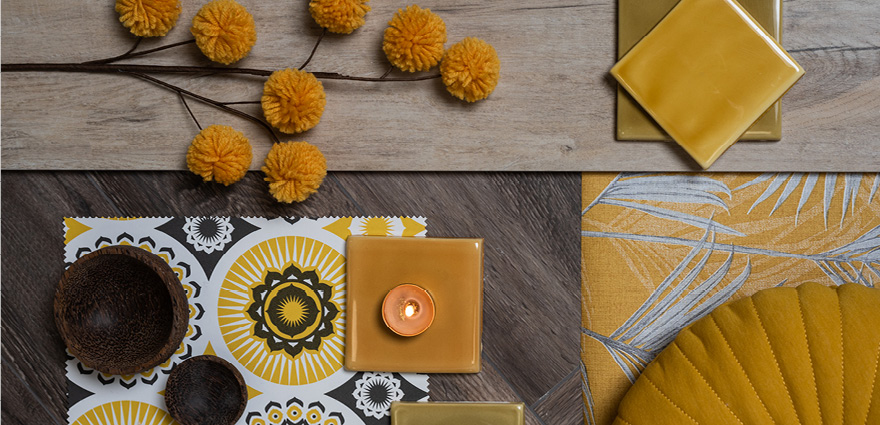
They say that fashion is cyclical in nature and that is why we are starting to see a return to the experimental glamour of the 1970s. Colour wise we will see a strong focus on rich, earthy tones like mustard yellow, ochre, olive green, chocolate, caramel, cream and camel. This trend will work really well with the Dulux Colour of the Year for 2019, which is Spiced Honey.
We can achieve that carefree 70’s vibe with retro-patterned wallpaper and fabrics with big bold motifs. Don’t be afraid to go bold with patterns as the 70’s were all about clashing designs.
Furniture is becoming decidedly curved so we’re seeing a lot more rounded edges on chairs, sofas and tables, and spherical lighting will be making an appearance too.
When I first started to see fringing appear in interiors again, I did cringe inwardly, but as this particular trend has developed we’ve seen fringing grow up a little and become more sophisticated. We’re now seeing furniture, lampshades, and even mirrors adorned with fanciful fringing.
Complete the look with chunky woven macramé wall hangings or plant hangers, shag pile rugs and a retro peacock chair and you’ve successfully given your home a fun 70s style revival.
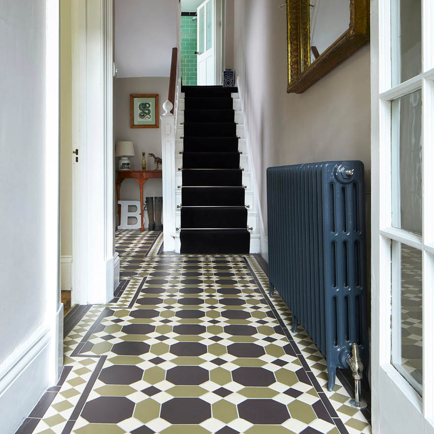
Jane has put forward the following tiles for a 70s revival; Winchester Classic Olive Field Tile, Winchester Classic Honey Field Tile, Winchester Classic Amber Field Tile, Tileworks Lignum Taupe Natural or Cream Natural.
New Neutrals
Say the word neutral in reference to home interiors and the first word that springs to mind is probably magnolia. This particular colour has been 'out' as a neutral for some time now, mostly only used in new builds and rental properties by property developers. White has often been touted as an acceptable neutral alternative and more recently grey has reigned supreme in interiors.
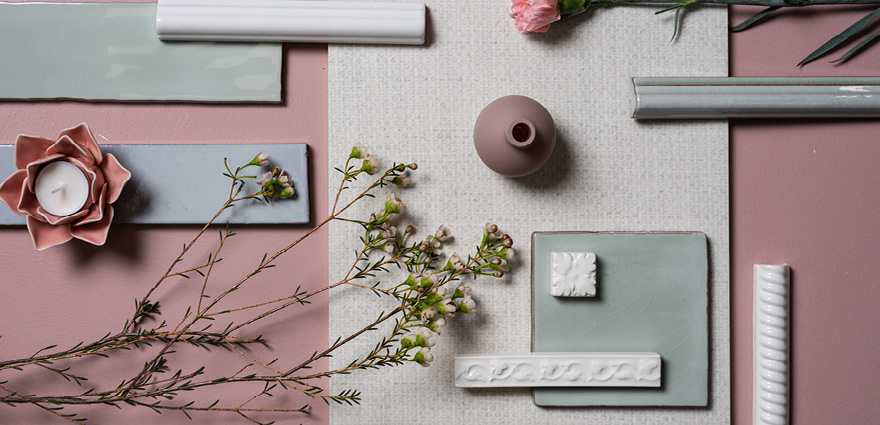
Grey is finally starting to wane in popularity though and it’s now the turn of the ‘New Neutrals’. Think tea rose, lilac, lavender, mint and pale peach shades. Basically pastel colours in a more muted shade are 'in' in a big way. This ice-cream colour palette is given a more sophisticated feel though thanks to the grey undertones that permeate these colours.
I personally think this particular trend has been building quietly in the background for a few years now as we have sought to add more warmth and delicacy to our homes. At the end of 2015, Pantone announced Rose Quartz and Serenity as their Colours of the Year for 2016. Then this year, Dulux chose Heartwood as their Colour of the Year and at the beginning of December Pantone declared Living Coral their Colour of the Year for 2019.
I’m really interested to see the development of this trend and we are already seeing it work its way into Scandinavian style homes which have traditionally relied on white as their go-to colour.
If you’re tempted by the New Neutrals, luckily Original Style and The Winchester Tile Company have an abundance of tiles with pastel pallets; Tileworks Maison Blanc – a gorgeous pale blue pile with a woven fabric effect, Tileworks Lignum Taupe Natural wood-effect tile, Winchester Mint tiles and mouldings, Winchester China White and Pure White mouldings, Winchester Cloud Smooth, Winchester Knightsbridge and Beaulieu Helmingham Gloss
Colourful Kitchens
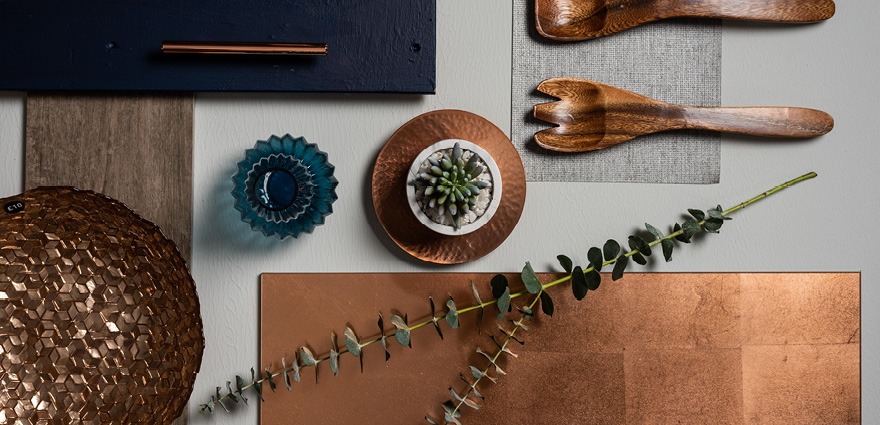
For a long time now, the cabinet colours of choice when it comes to kitchens have been white, grey, beige, black, or brown. Basically as long as it featured on the monochrome scale it was considered a safe option. Well, it would seem that we are done playing it safe in the kitchen and we are now seeing some really bold statement colours coming through.
Kitchens in deep navy blues, murky moss greens, jewel tones of teal and purple, and even the paler shades of the’ New Neutrals’ are becoming popular. These brave colour choices inject a lot more personality into our kitchens and really allow us to express our design tastes a lot more freely.
Taking things a step further, these colourful kitchens are often seen accompanied by statement metallic splash backs in hand-aged copper or gold leaf. They might also be finished with playful terrazzo surfaces.
Jane’s recommendations: “To get this look, pair Glassworks Copper Leaf wall tile with Lignum Taupe Natural on the floor and you’re on to a winner!”
