Victorian Floor Tile Design Guide
Victorian Floor Tiles Design Guide
We have designed this handy 'how-to' guide to take all the mystery out of planning your Victorian Floor Tile project.
Pattern size and angle - Deciding how you want your floor to look.
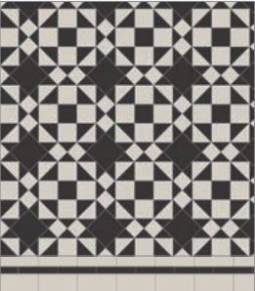
Some patterns have a much larger area of repeat than others, so choosing the right scale of pattern for your space is an
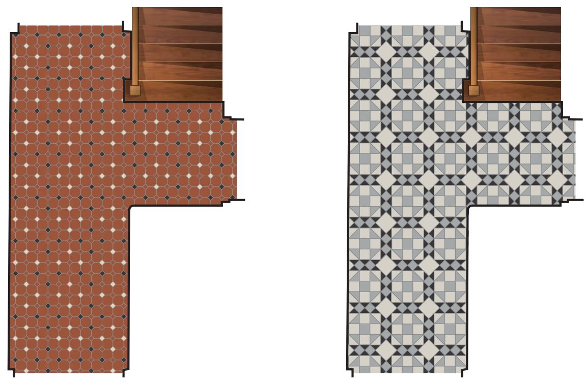
important consideration. For instance, Harrogate and Rochester will create a completely different effect when placed in the same space. For ease of comparison, all the pattern swatches in this brochure represent 1m2. It’s possible to scale some patterns up or down if needed, depending on the colours and shapes available.
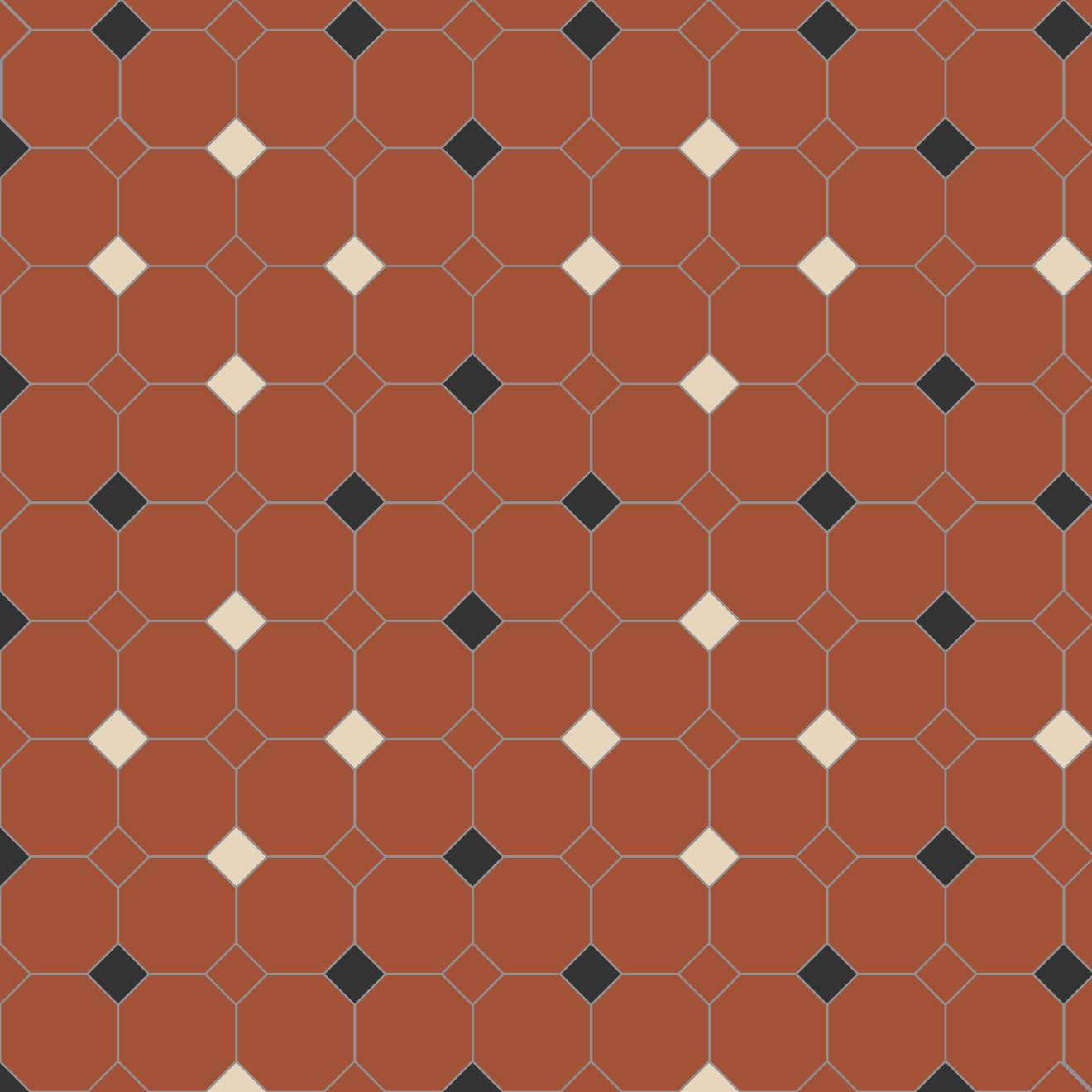
Harrogate 1m2
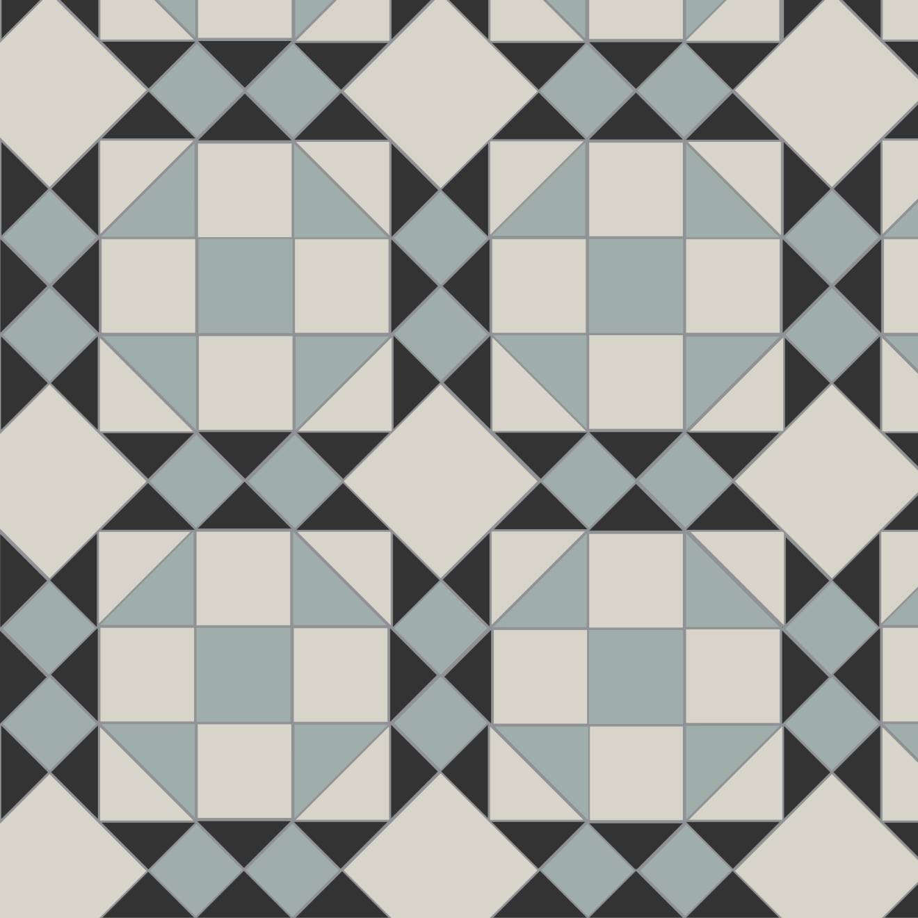
Rochester 1m2
These two patterns are shown below, in the same room for comparison.
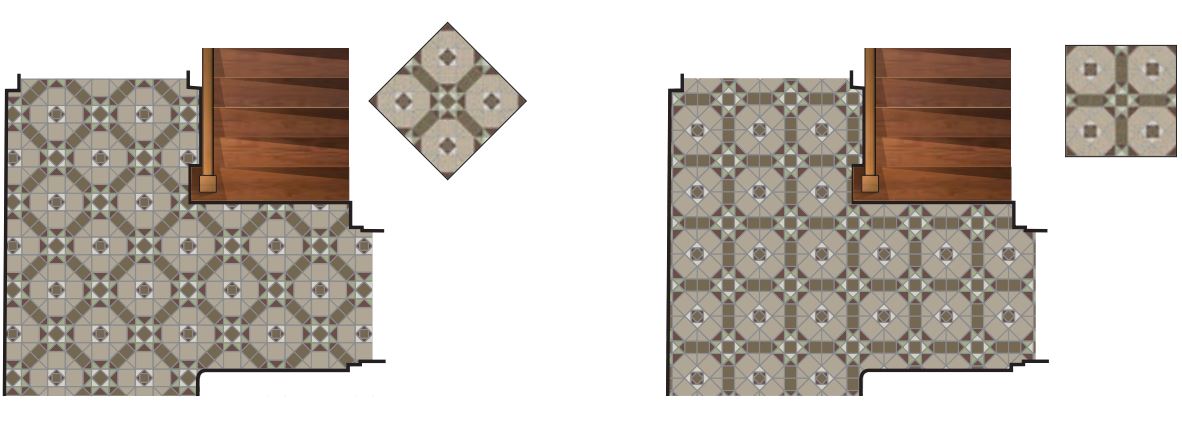
All of our patterns can be rotated to achieve a straight or diagonal orientation – in relation to the walls or sightlines of the
space being tiled. Below we show the Westminster pattern in its original diagonal version (left) and aligned to the walls (right).
Straight alignment can be useful in a long narrow space as it can creates a ‘path’ to follow, whereas a wider space may be better
suited to a diagonal design, that draws the eye in different directions. The choice is yours.
Your geometric floor tiles will become an integral part of your home, so it’s worth taking a little time to ensure that you get the
details right. There are no hard and fast rules (you can do exactly as you like!) but considering the following points could help
you achieve a more pleasing result and could even save time and money.
Pattern alignment in your space - The devil is in the detail
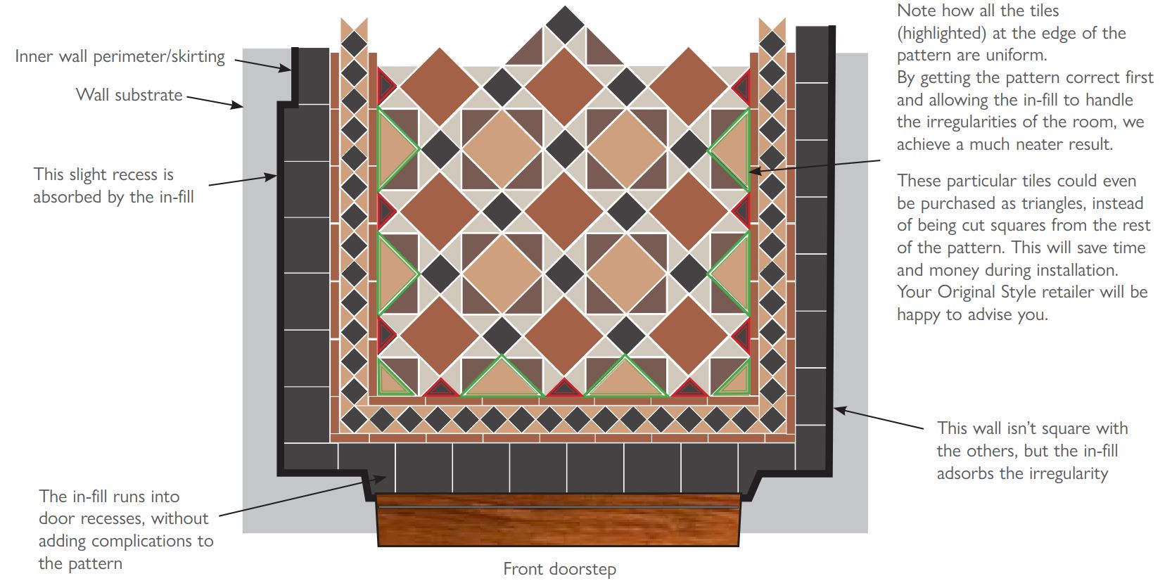
Below we show the example of a hallway in a typical British Victorian terraced house. We use this situation because the majority of factors to consider are covered. In this instance, there’s a corner to turn, a staircase, there are doors to adjoining rooms with varied casing details – and as with most buildings (even new ones) the walls aren’t completely square.
Whatever age or style your property is doesn’t matter – the principals still apply
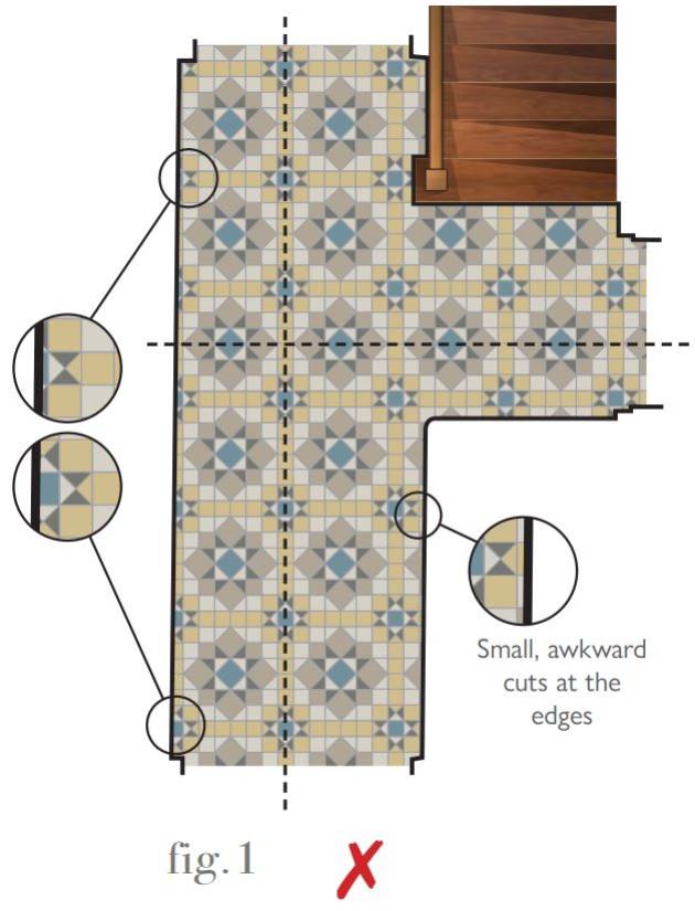
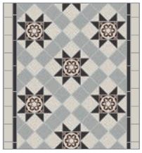
The tiles have been laid by starting at an arbitrary point, without considering the visual alignment of the pattern elements and the doorways, or how the tiles meet the edges of the room.
With no border to isolate the pattern, there are lots of time consuming, wasteful and awkward cuts around the perimeter.
The overall effect is visually confusing. As the walls aren’t completely square, the pattern has been cropped awkwardly and inconsistently as you can see along the long left-hand wall.
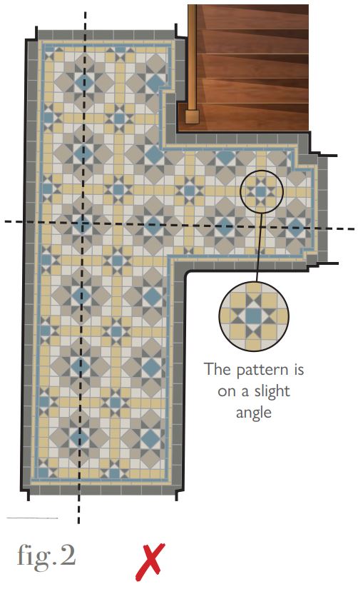
Here, the addition of a border has helped isolate the pattern from the walls, but by using the long wall as a straight edge and a fixed width border, the whole pattern is now misaligned – because the wall we started from isn’t straight! This is particularly noticeable in the area at the foot of the stairs.
No part of the pattern has been centred on the sight lines from the doorways either, which may be annoying to live with.
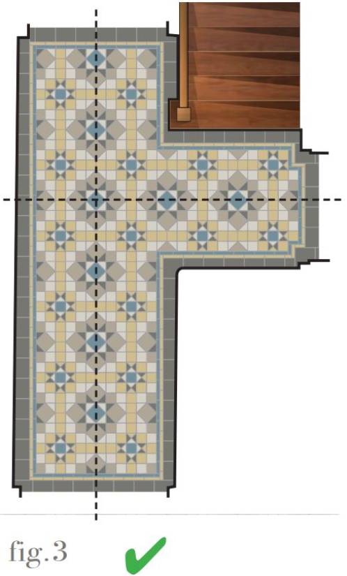
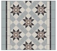
Here, we’ve used the pattern as the starting point, rather than the room.
We’ve chosen the flower-like element of the design as the centre and it’s been aligned as closely as possible with the front to back sightlines and the view from the door on the right.
Note that the pattern is completely symmetrical and has mainly whole tiles around the edges.
Doing it this way ensures that you see the pattern first and that your eye is drawn by the design and not to the irregularities of the room.
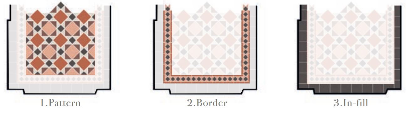
Pattern / Border / In-fill - the three steps to a perfect plan
Think about your new floor as three separate elements:
Pattern - this is the primary focal point. Whatever shape area you’re working with, the pattern is the centrepiece. Think of it as a patterned rug on a plain floor. Using the information in Part A and Part B of this guide, decide how you’d like your pattern aligned in the space.
Border - this is the frame of your pattern, or the ‘fringe’ in our rug analogy. You may choose a wide, elaborate border or a simple pencil line (see Part D of this guide) but whatever you choose, the border provides an attractive way to contain your pattern and is a design feature that can really elevate the finished result. Detail can be added here by using one of our handcrafted decorated borders.
In-fill - this is the plain but vital bit around the edge that (hopefully) you’ll barely notice when your floor is complete. The in-fill consists of 151mm (6”) tiles fitted around the perimeter of your pattern/border combination. These tiles will be cut down as neccessary by your tiler to ‘in-fill’ the space between the pattern and the walls. This way, variations in wall squareness, door thresholds, boxed pipework or other irregularities are all absorbed by the in-fill tiles, which will isolate all distractions from your beautiful patterned floor. You can use a colour that features in your pattern, or choose a complete contrast.
Here’s an example of a Lambeth pattern (p.42) with border and in-fill in a front hallway:
Using Borders - accessorising your pattern
When deciding on a border, you can choose a plain pattern-free area to surround your main floor or go to town
with something grand. Here, we show how border size and detail can affect an area of pattern.
The same area of Blenheim pattern is shown below with a succession of matching borders of decreasing complexity and size:
This is a version of a Keats border. If this were a hallway, this border might be a little heavy. It overpowers the pattern in this situation but would be ideally suited to a larger room.
This is a version of a Bennett border. This popular design is a good match in scale for the main pattern.
This is a version of Simple border 3. Using a less complex border can help focus attention on the pattern. Here the use of Grey at the sides really makes the Dover White stand out.
For ultimate simplicity, this slim Simple border 5 is a good option for small spaces where maximum pattern coverage is required.
Adding and subtracting with borders
Add extra colours to an otherwise monochrome pattern (this is Buckfastleigh) by introducing them in a border. This is a version of Clare.
Add drama to a subtle pattern (this is York) by using a strong contrasting border. This is Melville.
Calm a complex pattern (this is Eltham) by using a plain border option. This is a version of Simple border 3.
Download our Fixing Guide
All fired up and ready to go? Our fixing guide contains all the information you and your tiler need to install our Victorian Floor Tiles.
Need a helping hand?
Let our Design Service take the strain out of planning your layout. Our skilled team can provide a visual of your chosen design as it will look in your own room along with a breakdown detailing the pieces you will need to create your perfect Victorian Floor Tile installation.